


How to Choose Paint Colors for Your Home Interior in 5 Steps


Last updated on August 24th, 2022
With the vast array of color choices available today, it can be hard to know where to begin. And if you’re like many homeowners, you want to make sure you’re not only choosing the right colors, but also colors that will coordinate from room-to-room, or from interior to exterior. The good news is that there are many easy resources available to help you create your personal palette with confidence.
Think of a favorite rug or fabric you own. Often these objects are your favorites because they feature all the colors you like. Use the combinations as a guide to choosing colors for your wall.
-

- Color Snap Visualizer Family
For inspiration, try ColorSnap® Visualizer for Web, Mobile, or iPad to capture colors from your surroundings and match them to Sherwin-Williams paint colors. Explore over 1,500 colors to get inspiration from a photo. Virtually paint your rooms with ColorSnap® Visualizer for Web and iPad. Try Snap It to instantly turn any online image into a color palette.
1. Choosing a Color Scheme for Your Home
For a good start – “Try a basic understanding of color schemes–monochromatic, analogous, and complementary,” says Sue Wadden, Director of Color Marketing at Sherwin-Williams.
A monochromatic color scheme involves selecting a single color and then using colors that vary in lightness and saturation to create a clean, sophisticated look.
For an analogous color scheme, select a color, then for accents, choose shades that appear on either side of that dominant color on the color wheel.
Finally, a complementary color scheme, choose a dominant color and then select colors directly across on the color wheel to create contrast. The two colors will intensify each other and create a vibrant look and feel.
-

- SW 7682 Bee’s Wax
-

- SW 6263 Exclusive Plum
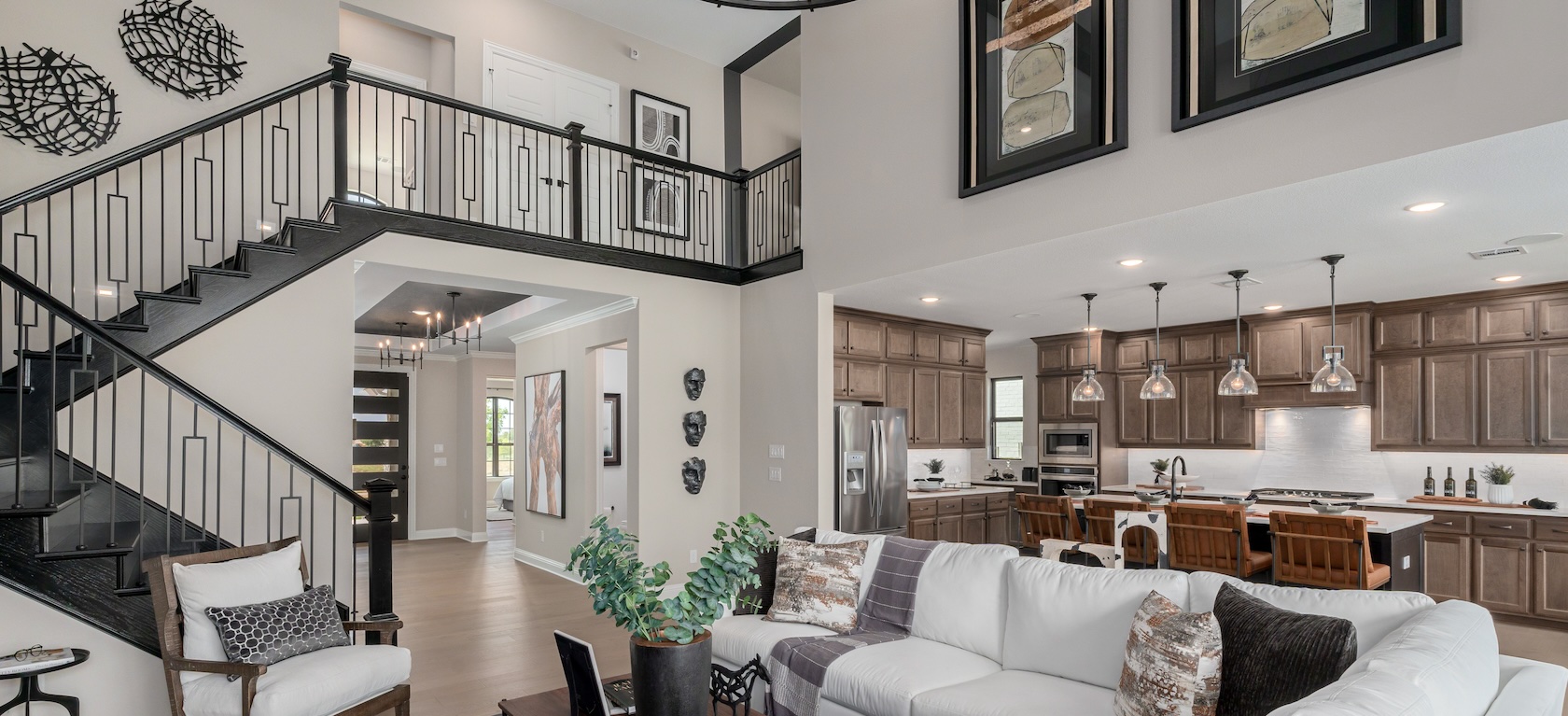
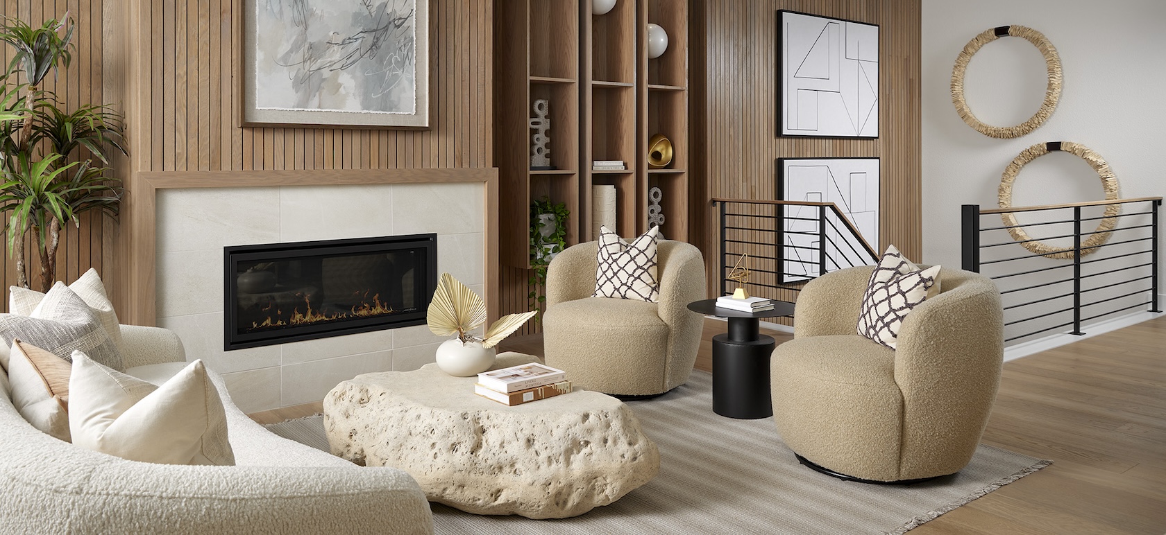
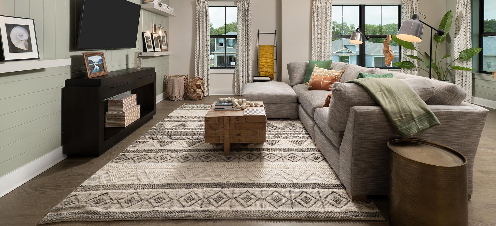
2. Coordinate Color Scheme Ideas into Your Interior
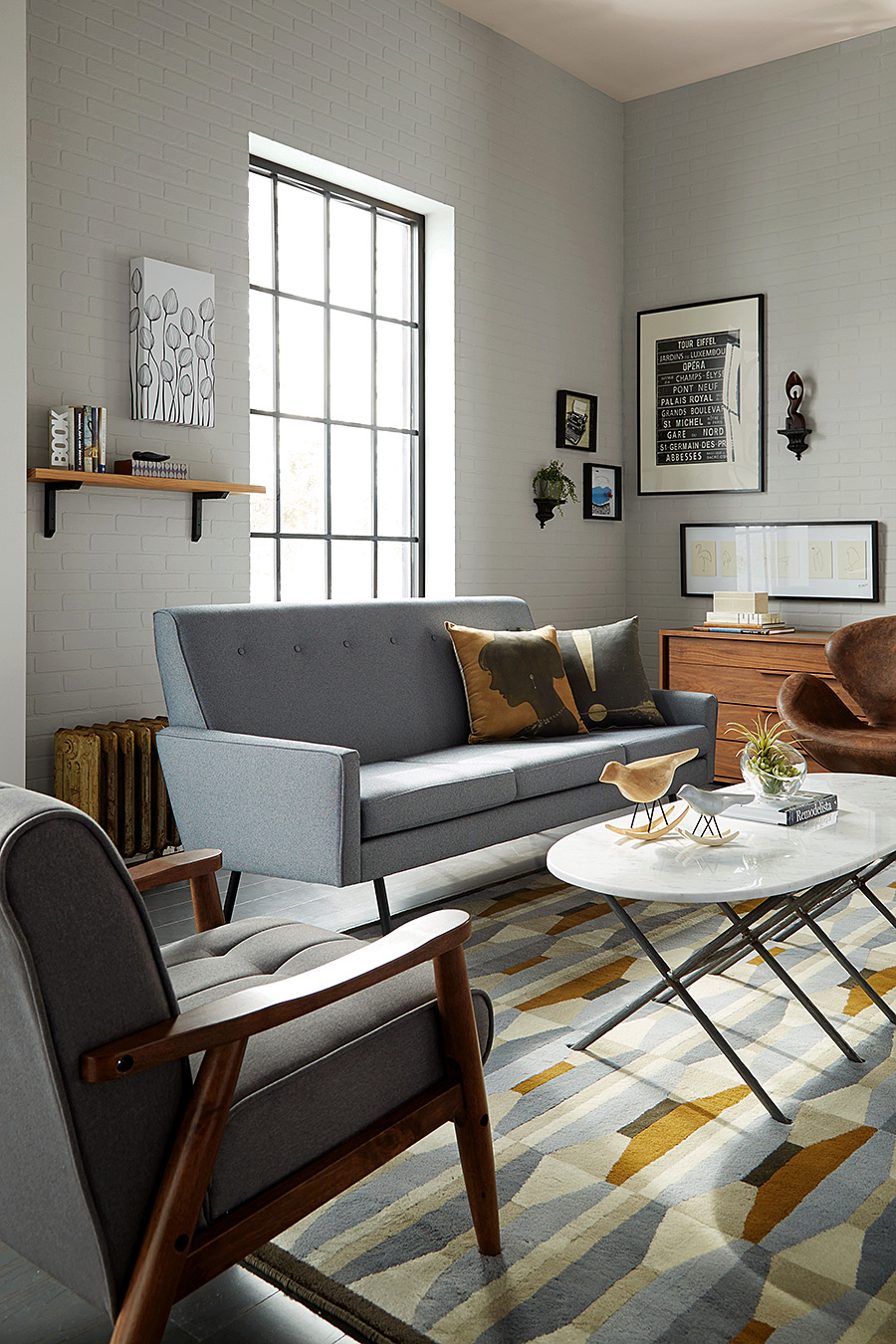
For a smooth transition between spaces, try choosing a color for one room and paint the adjacent space two shades away, lighter or darker, using tones from the same color chip. By unifying fabric, wall and floor color, your eye can take in the volume of space rather than focus on any one object. These cozy grays and warm beiges instill a look that’s casual, comfortable, and classic.
-

- SW 0055 Light French Grey
Wake up beige. Adding shades of the same color creates depth and interest. Paint below the chair rail a deeper shade of the existing wall. Choose textured curtains from the same color family.
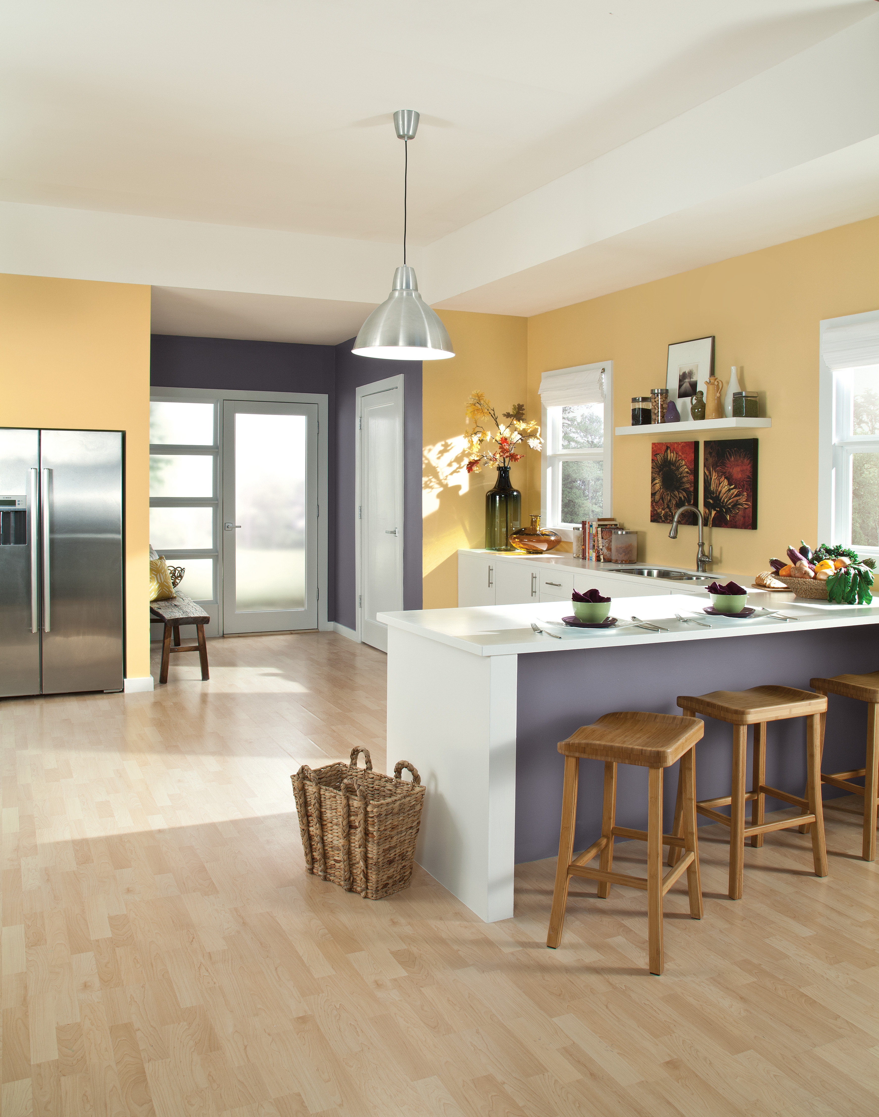
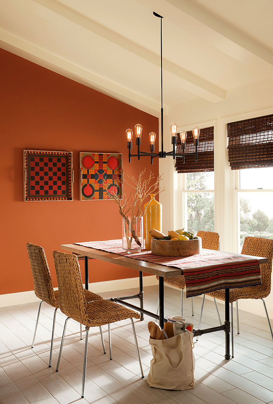
It doesn’t take much color to punch up a space. Create a feature wall with a contrasting or complimentary color. A nook, window bay or the wall behind your headboard can be great candidates for feature walls. Even in a compact eat-in kitchen, you can make a flashy statement. A feature wall with a strong accent color and attractive art will draw attention to the seating area, which also helps create a dining space that’s separate from the rest of the kitchen.
-

- SW 6385 Dover White
-

- SW 7703 Earthen Jug
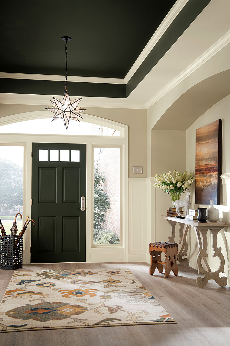
Hallways present an often-overlooked opportunity to add personality. The end of a hall is a perfect chance to feature a bold, dramatic color that may otherwise overpower an entire room. Encourage more than a passing glance by displaying interesting artifacts on a narrow console.
Pulling a palette of wall colors from the textiles featured in the room is a foolproof way to create a cohesive look. In this case, the area rug was our inspiration. The result is a warm welcome with a bit of drama achieved by using the darkest hue in the tray ceiling.
-

- SW 6174 Andiron
-

- SW 7011 Natural Choice
-

- SW 7542 Naturel
3. Test The Paint Colors You’ve Selected
The easiest way to test is to simply tape the color chip up on a wall that sees both natural and artificial light. Watch the color over the course of a few days, taking into account fluctuations in natural light. Early morning light makes colors appear luminous and glowing, mid-day light can make colors look washed out, and late-day light is warm as the sun hits the horizon.
4. Make Sure to Test Colors in Various Areas
What direction do the windows face? A northern exposure is cooler, so a warmer color choice might be appropriate to compensate for the lack of sunlight. Southern exposures, on the other hand, get the most light all day long; neutral tones may be better in that case.
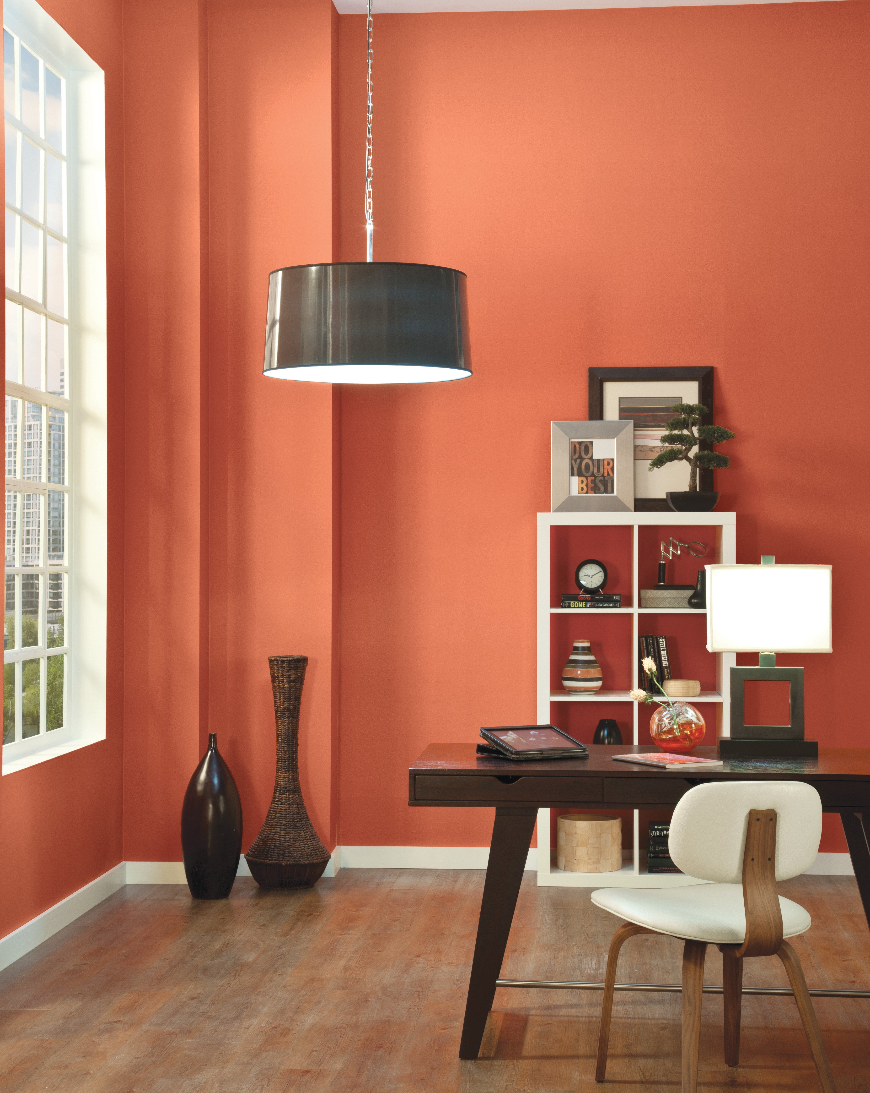
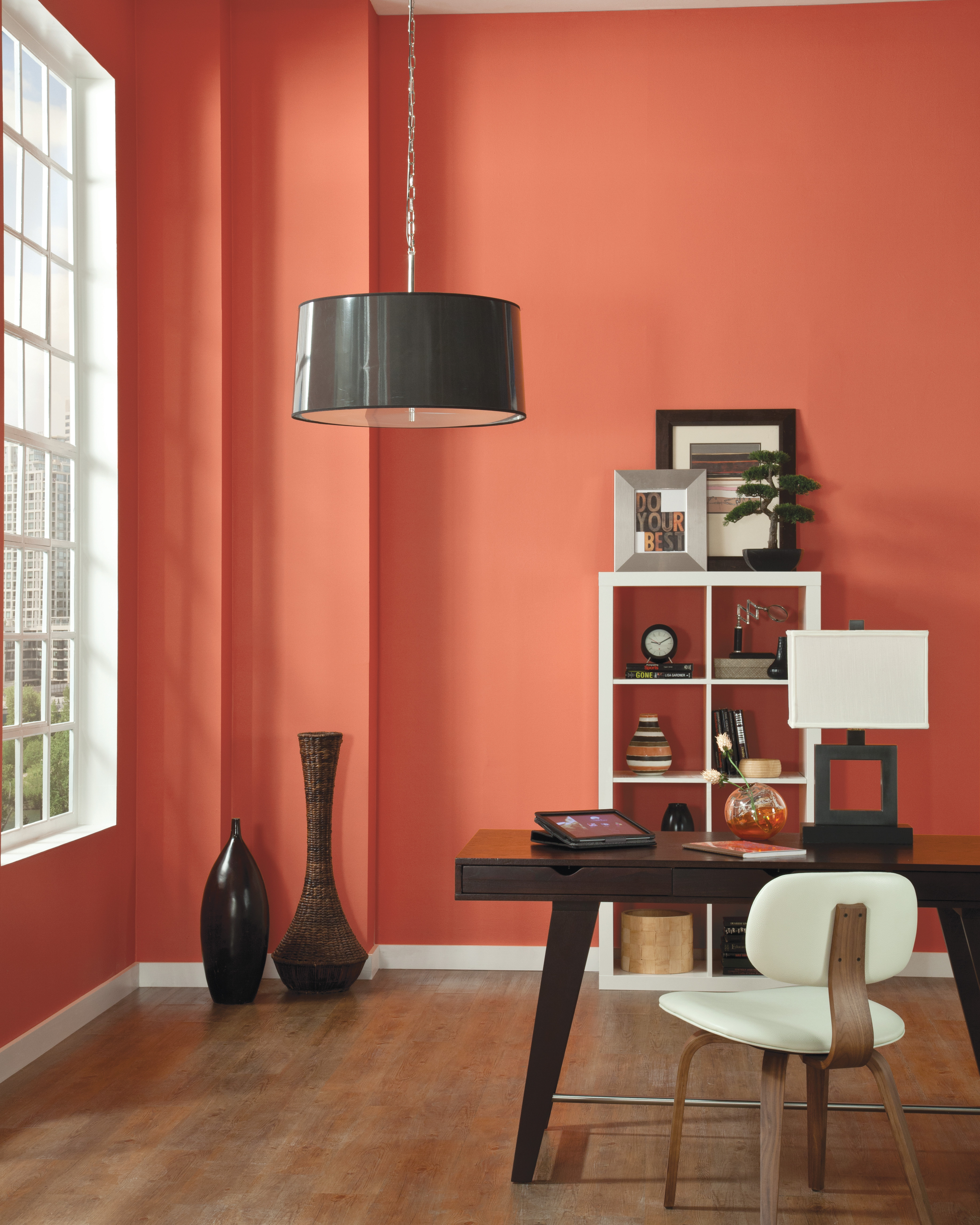
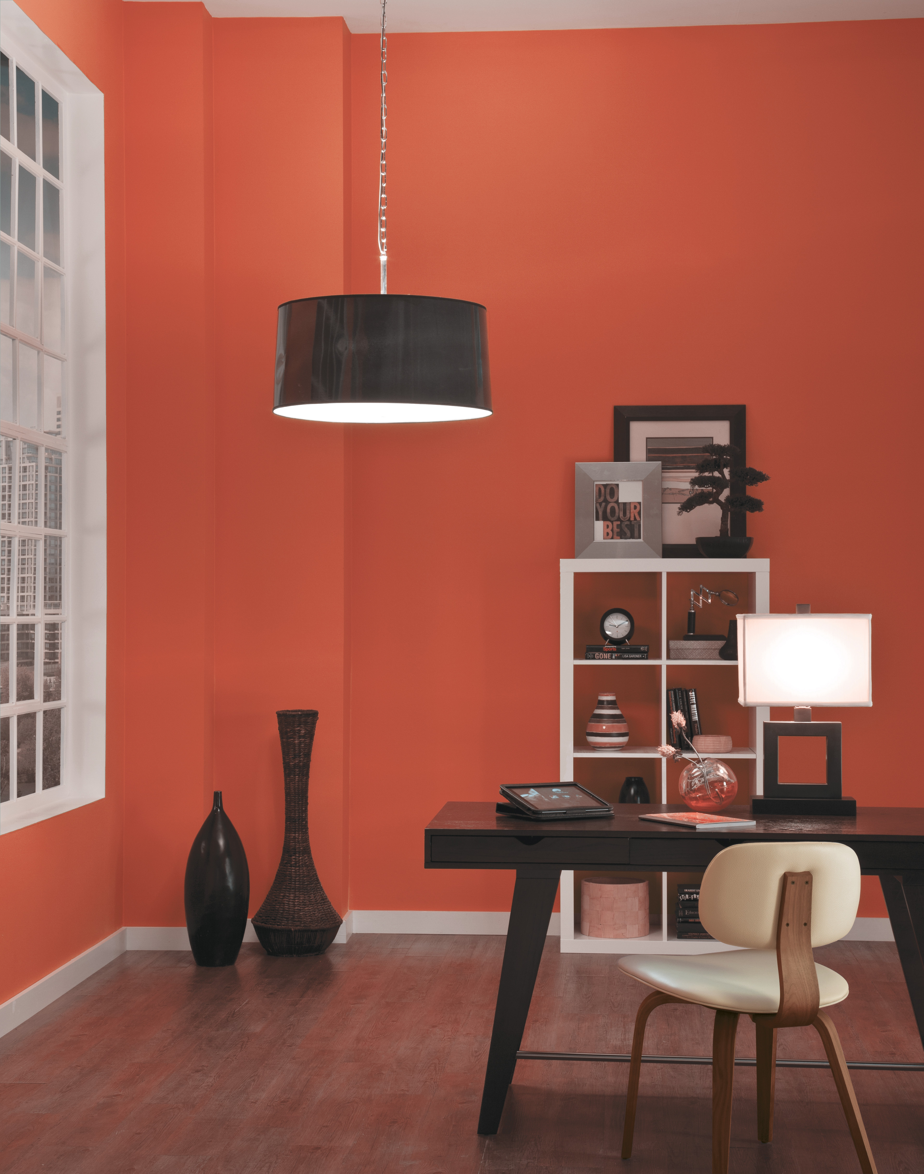
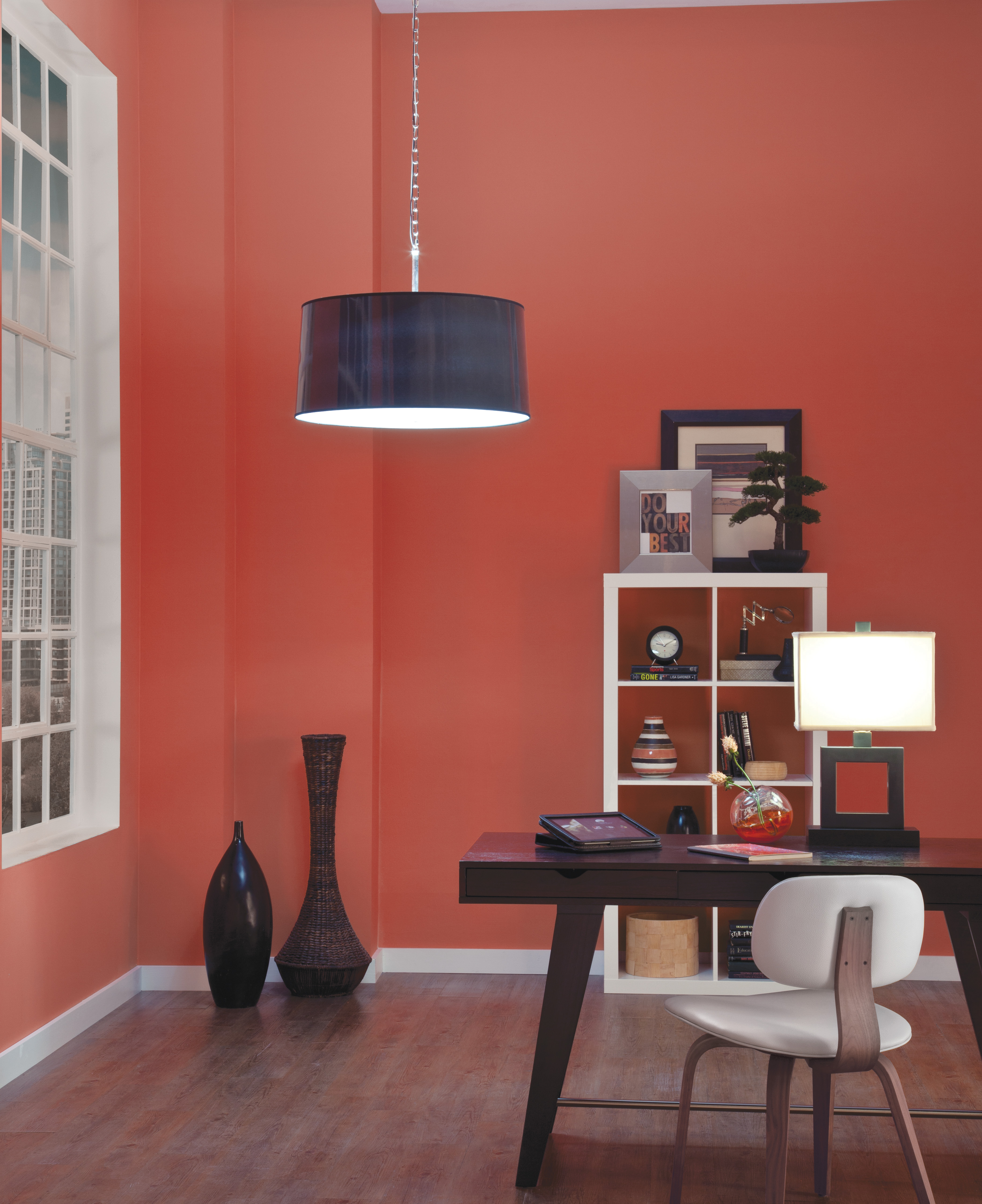
5. Be Aware Of Artificial Light’s Effect on Paint
Your lamps and bulbs will often dictate the true color representation. Incandescents provide warmer light that enhances reds, yellows, and oranges. Fluorescents provide cooler light that enhances blues and greens. LEDs are more flexible; their light looks good with most paint colors. CFLs can offer varying types of light, so check the Kelvin rating. The lower the number, the warmer the bulb. Meanwhile, full-spectrum bulbs mimic daylight. Halogen bulbs also closely resemble daylight — and make colors pop.
Toll Brothers’ vendor partner Sherwin-Williams, the largest producer of paints in the United States, contributed to this story.
2 Comments
Great, common sense advice. Thank you
Hi Arlene, we’re thrilled to hear you enjoyed our blog!