Using Color in Interior Design: Expert Advice from Sherwin-Williams
Last updated on November 25th, 2024
Toll Brothers recently took to Instagram with our partners at Sherwin-Williams to answer a variety of interior design questions posted by our followers. During this lively and informative social media chat, experts at Sherwin-Williams touched on an array of topics, ranging from color palettes that pair well with natural woods to the best hues for fostering productivity.
Check out the recap of our conversation below, along with some of the incredible paint colors from Sherwin-Williams showcased in our Toll Brothers model homes across the country. This expert advice on choosing the right paint color for every room of your home is sure to inspire your own luxury home design choices.
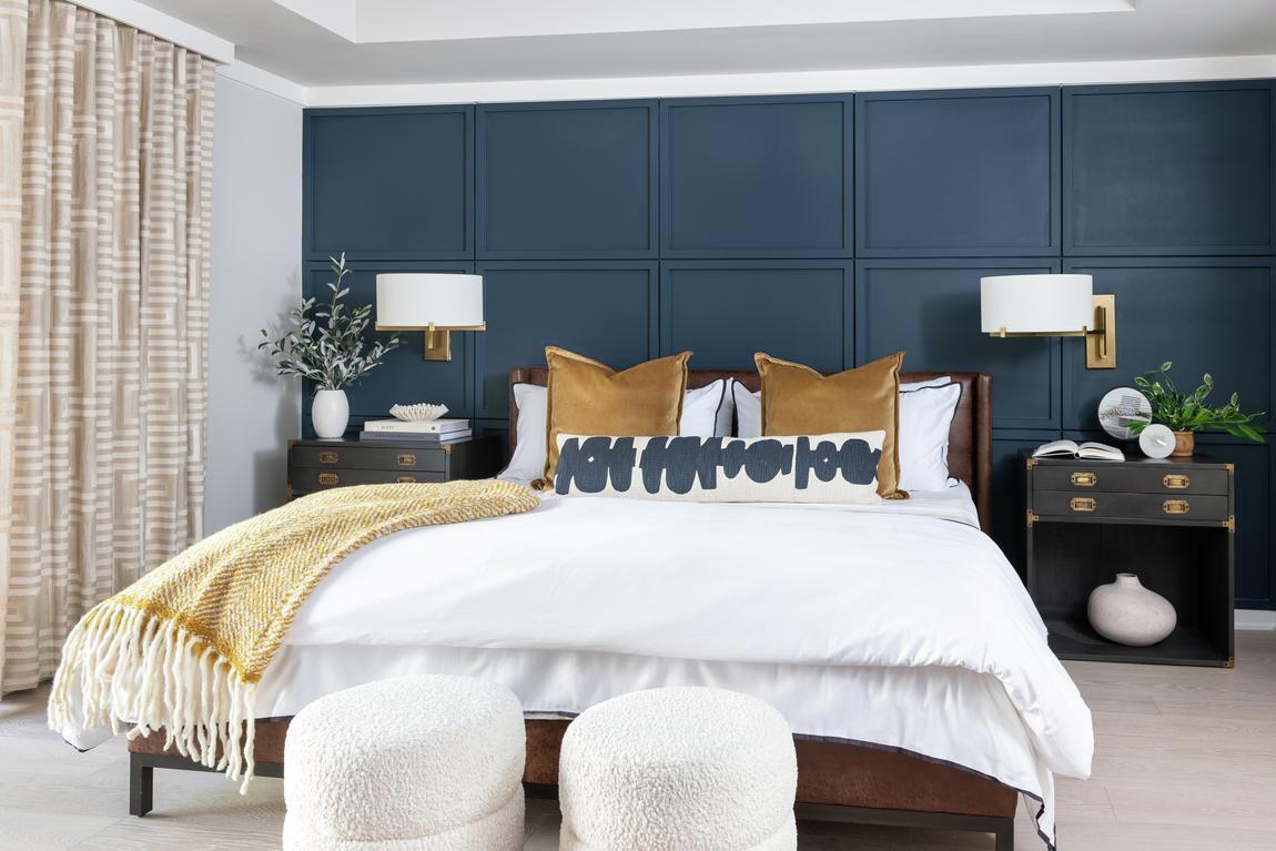
Which palette do you think would look best in a guest bedroom?
Navy blues and charcoal blues, like Naval SW 6244 and Charcoal Blue SW 2739, look great with silver or gold accents and can inject some colorful drama at the same time.
Which color palette pairs best with natural wood materials and features?
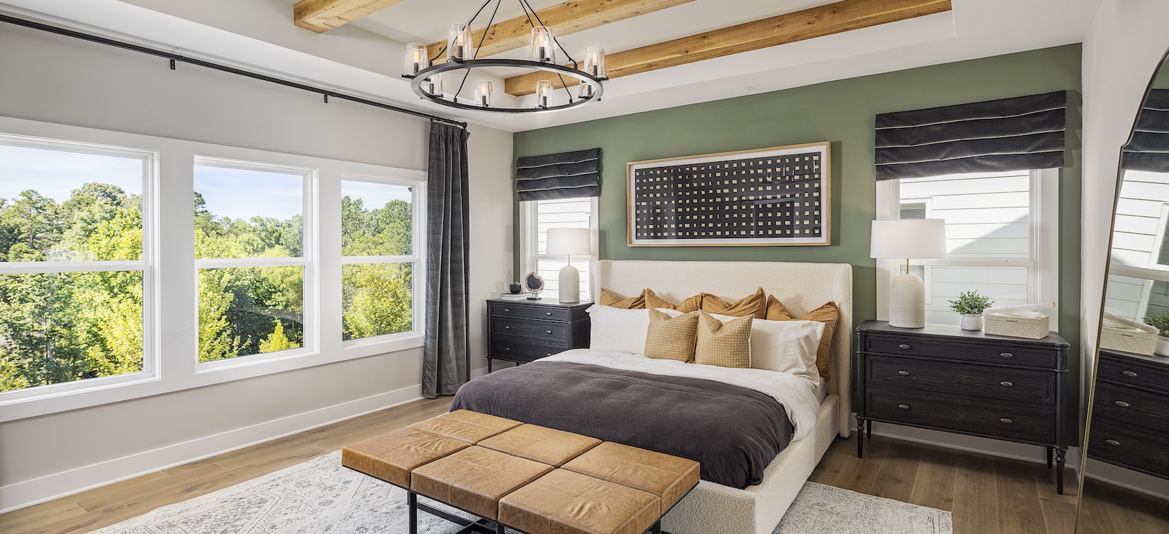
Wood materials introduce warmth into your space but pay attention to how the wood ‘reads’ in your space. For example, does it read yellow, brown, or red? If your wood reads yellow or red, consider using a green or green-gray like Evergreen Fog SW 9130 or Oyster Bay SW 6206. If your wood reads blue, consider using a muted blue like Rain SW 6219 or Stardew SW 9138.
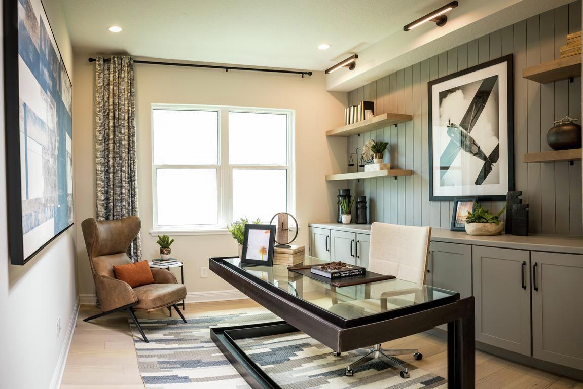
What accent wall color would you recommend for a living space that includes copper fixtures?
Blues and blue-greens look fantastic with copper. Consider using Teal Stencil SW 0018 or Meditative SW 6227 for a pulled-together look.
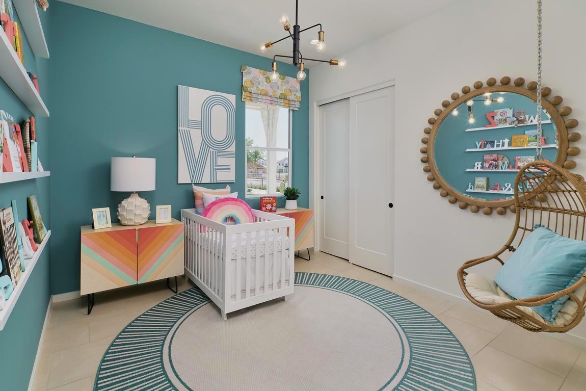
Why are earthy, nature-inspired neutrals so popular in interior design, and how do they influence the home environment?
Colors pulled from nature have always been popular, but they are now more popular than ever. We emerged from the pandemic with a greater appreciation for our homes and the greenery surrounding our space. When you introduce earthy natural colors such as Frosted Fern SW 9648 or Macadamia SW 6142 into your home, the lines are blurred between inside and outside, echoing the familiar and welcoming the influence of the greenery and nature surrounding your home.
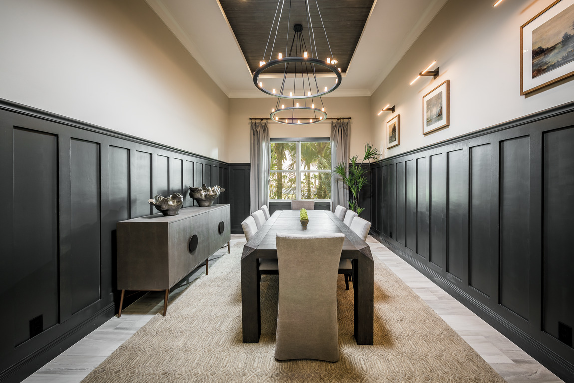
Which color accents or palettes do you recommend for flex rooms that are fun and inviting, but not too bold?
Today’s homes feature flexible spaces that can be living areas, game rooms, and occasionally offices all at the same time. Warm neutrals with a drop of yellow are the best choice for a flexible space. Eaglet Beige SW 7573 or Lotus Pod SW 7572 will bring light and warmth into your flex room or home office.
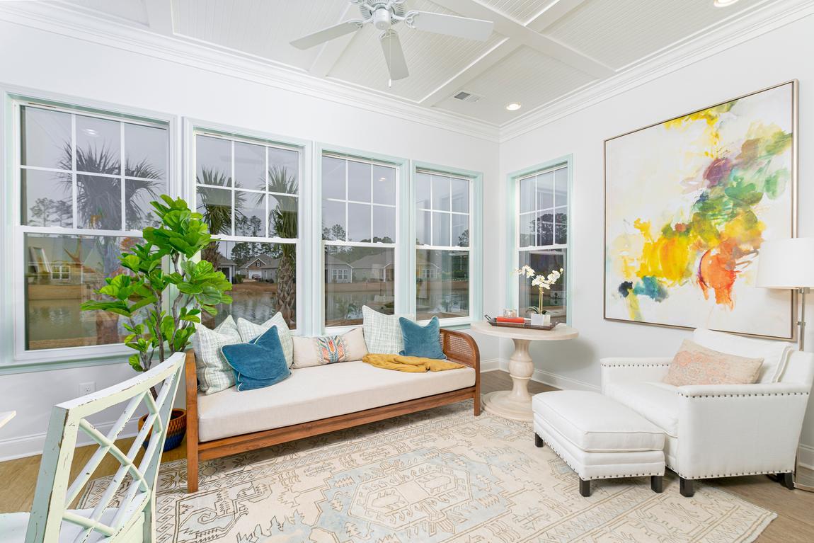
What are the hottest colors for 2022 that I can use in a family room?
Greens, like our Color of the Year Evergreen Fog SW 9130, are hot right now. Any green that reminds you of the outdoors would be a great choice.
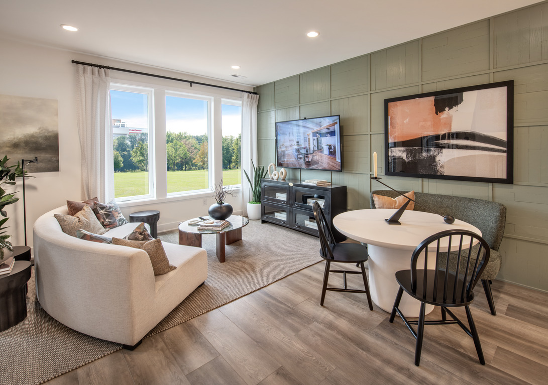
Which color palettes do you recommend for those who love a modern farmhouse interior style?
Modern Farmhouse style is all about simplicity and clean, timeless colors. This palette relies on warm whites and soft colors to create a fresh look. Alabaster SW 7008, Sea Salt SW 6204, Aged White SW 9180, and Front Porch SW 7651 are soft colors that pair beautifully with roughhewn wood used in the modern farmhouse style.
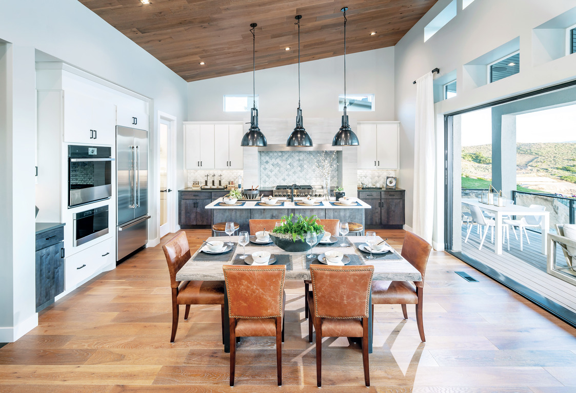
How does color impact our wellbeing, and which shades are the best options for creating a serene space that encourages wellness?
Color is a powerful tool and can be used to influence mood and action. Colors on the blue side of the spectrum are cool and will create a serene, calm vibe. For instance, Rainwashed SW 6211 is a soft blue-green that denotes a spa, ethereal feeling. Colors on the red spectrum are warm and will create an energized atmosphere. A color like Invigorate SW 6886 is a zippy orange that will get you moving.
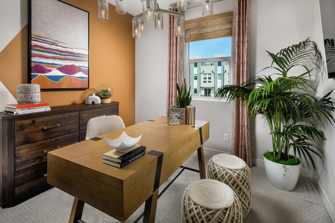
Which colors do you suggest homeowners use to elevate productivity in their workspace?
Our new way of living in our homes incorporates at least one home office. Blues and greens are great choices for two different reasons. Blue is a soothing color and will help calm the mind and aid in concentration that requires focus. Faded Flaxflower SW 9146 is an excellent example of that. Yellow is an energizing color and helps one feel confident and ready to take on any task. Butter Up SW 6681 is a great choice to energize and stimulate creativity.
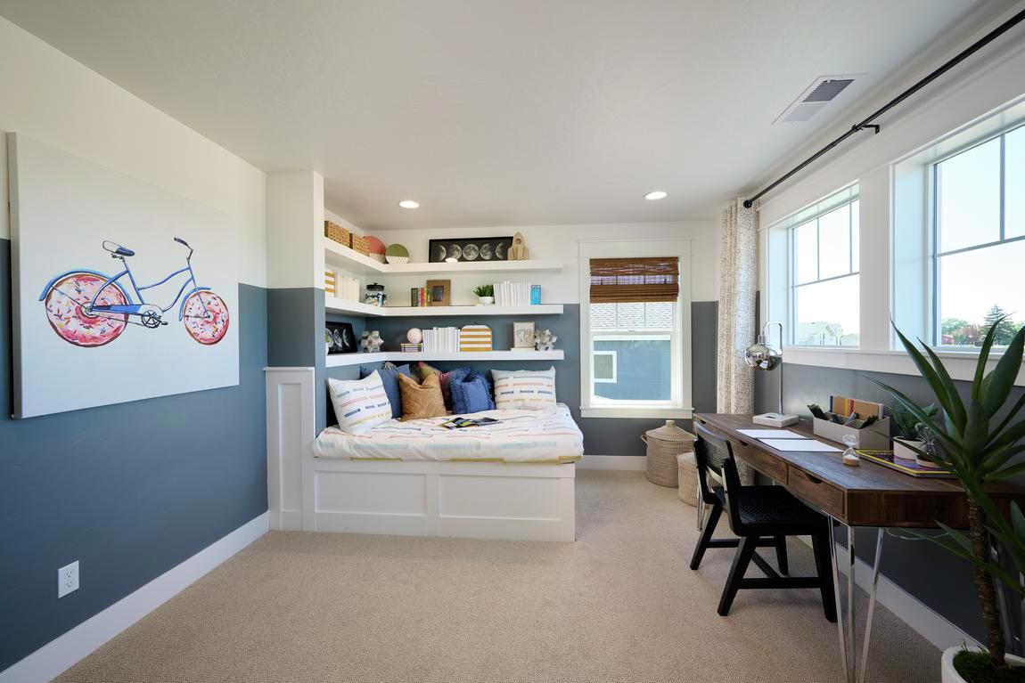
How does the location of your home influence interior color decisions?
Your home is both a reflection of you and your surroundings. Your interior and exterior palettes should reflect that. For example, homes bathed in the sun look best with bright, vibrant colors reflecting the sunshine around them, while homes nestled in the mountains look fabulous, echoing the earthy greens and browns of the forest.
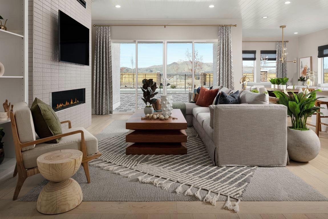
To see more trending colors used in interior design, check out our Toll Brothers Instagram, and to learn more helpful and on-trend color tips, check out our other blogs about paint color.

